UX: Site Redesign
My role
I was one of the primary UX designers on this project from kickoff to launch. I worked with content strategy and research early on to shape the page goals, then led the template handoff process with the AEM authoring team meetings through final implementation.
The scope
Starting in summer 2022, we were tasked with redesigning thomsonreuters.com for a January 2023 launch using our existing AEM platform with minimal dev changes. In short: a full redesign built entirely from current components.
The solution
We focused on the single user journey that mattered most: first visit to trial signup or purchase. That focus turned a sprawling task into focusing on just 6 core page templates covering Homepage, Discipline, Category, Subcategory, Product Overview, and Features.
The results
The redesign drove real engagement gains: 77% more homepage clicks, 37% more visitors reaching product overview pages, and 2x more lead form participation over a visitor's lifetime. It also dropped page creation time by 62%, and go-to-market timelines shrank by a week.
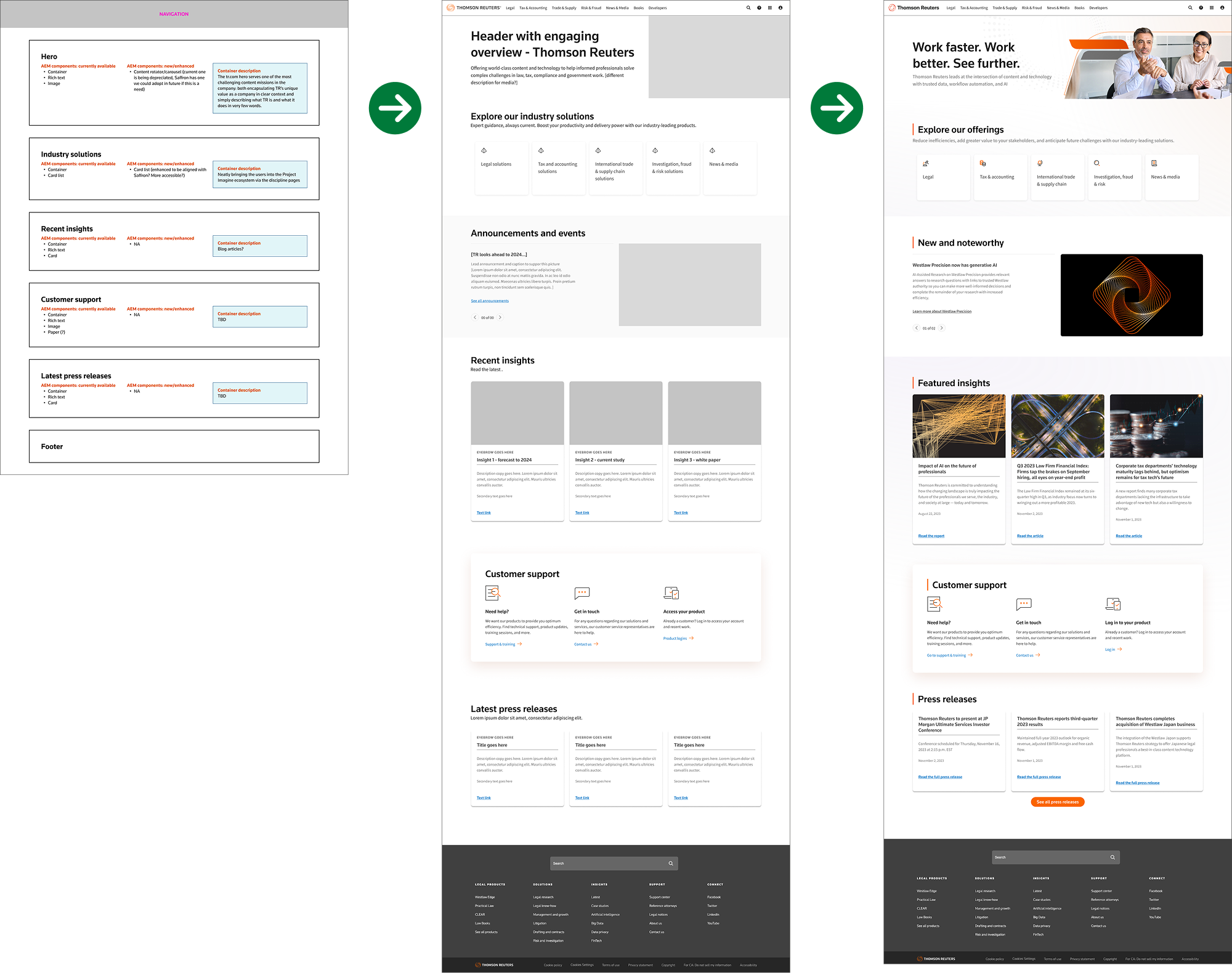
The Process
The focus of all these templates was to look at the content structure first and break out the page in to sections. What is the goal of the page and how does each section serve that goal? Additionally, what current components could we use to achieve these goals?
Once we had that structure solved, we then moved to the wireframes. Being we were using all current capabilities, this made it easier to focus on which components best communicated the goal of each section.
We were able to do user interviews with the wireframes and initial Ui designs, and we used that to inform the final template.
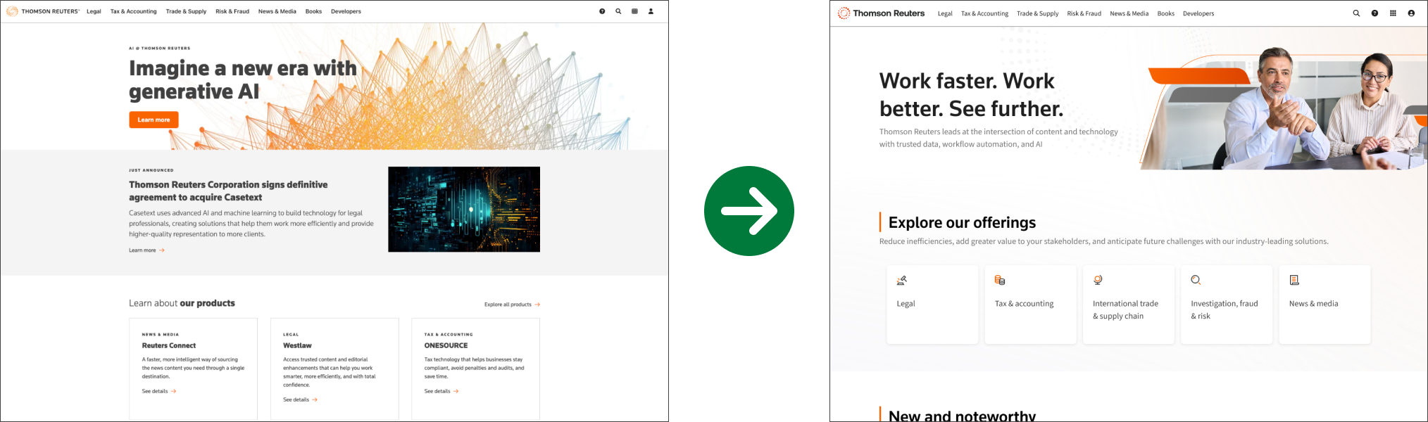
TR.com Homepage
Although the majority of page templates were launched live in January 2023, the homepage redesign wasn’t done until the summer of 2023 and launched live in November of 2023. The major change in this redesign was going away from a product focused card bank and instead focusing on a discipline card bank. This resulted in increased engagement and improved funnel progression rates to our product pages.
Increased clicks on disciplines vs products
Previously, only 3.1% of users would click on the product cards. With the new discipline focus the click rate increased to 5.5%.
More users reach a product overview page (POP)
The percentage went from 4.0% to now 5.5%.
Visitors are now more likely to log in to their products via the homepage
This change went from 7% prior to launch, to now 12%.
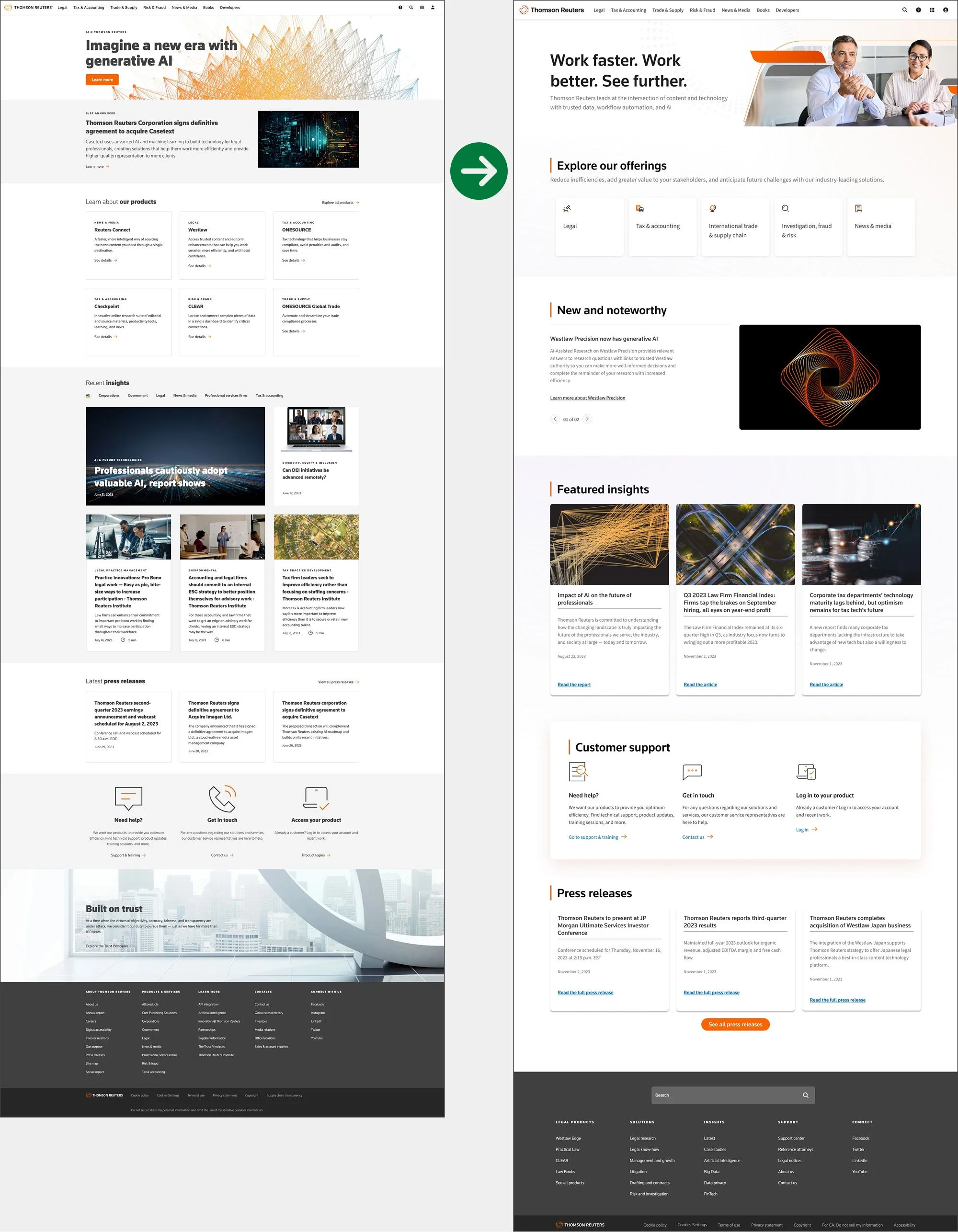
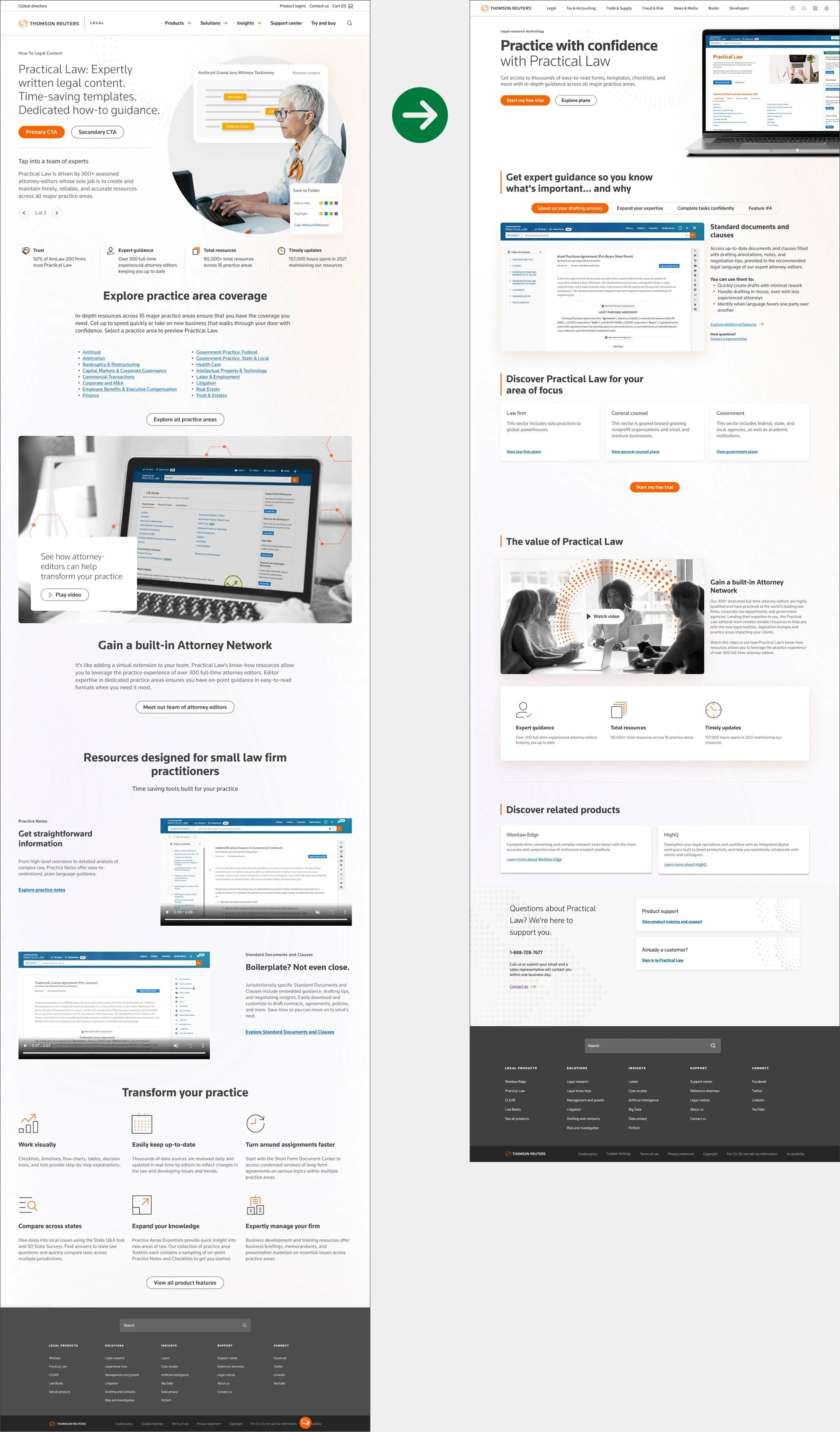
Product Overview Page
The Product Overview Page (POP) is one of the first templates we worked, as it is one of our most highly visited pages. We learned early on in testing that our users wanted to see what our products looked like. Stock photography of people, although visually appealing, did not bring any value to the user when deciding whether or not to purchase a product or sign up for a trial. So we moved away from that and put our product screenshots front and center.
Better performance in lead form participation
1.59% of visitors using the new template took the desired action (e.g., filled out a lead form), compared to 1.27% using the old template.
Higher conversion rates
Looking at unique visitors (counting each user only once regardless of how many times they visited), 2.96% of users on the new template converted, vs. 2.12% on the old one.
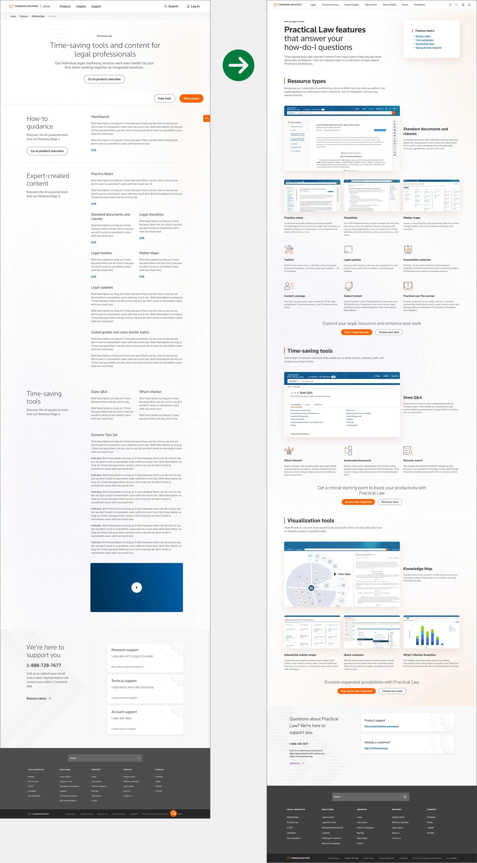
Features Page
Equally high priority as the Product Overview Page, the Features page template was designed and tested in tandem with the Product Overview Page. An overview page is great for high level, but we needed a way to present information to users who were ready for that next step in digging deeper in to what our products have to offer. The Features template also allows for greater flexibility in content as each section can easily add or subtract rows of content as needed, and based upon priority.
Major impact to lead form participation
When a visitor views the Product Overview Page and features pages in tandem, they are over twice as likely to submit a lead form than those who viewed just one or the other.
Lifetime impact
The features pages already had a high single-visit lead form participation rate (1.95%), but that rate more than doubles (to 5.19%) when looking over the lifetime of the visitor.