UI: Design Exploration
My role
I was the primary UI Designer, partnering with a UX Designer and a Content Writer.
The solution
The UX Designer and Content Writer defined the page's goals and structure. From there, I took their wireframe and developed it into the final high-fidelity UI.
The scope
Our newly formed UX team needed a way to build cohesion and shared process. This project became our test case: explore what a new discipline landing page should look like.
The results
This was exploratory by design. But the thinking behind it held up. The patterns we tested became the foundation for a design system the company adopted a few years later.
Round 1
This is where I picked up the project, starting from a wireframe the UX Designer and Content Writer had already filled with content.
Hero image
Kept short to avoid banner blindness and preserve space above the fold. Since this page had no single actionable goal, we kept it simple, giving users just enough to confirm where they'd landed before moving them to the next section.
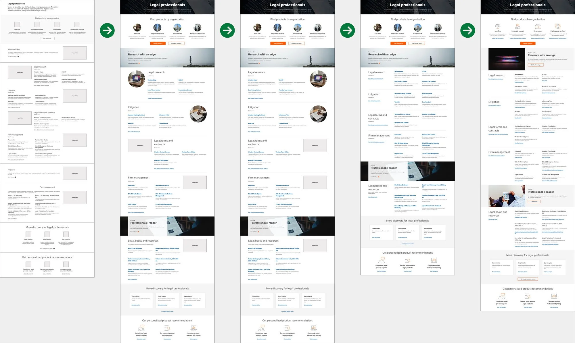
Product listings by section
Followed the wireframe's staggered, zigzag layout with circular imagery. In practice, the zigzag pattern caused real scanning friction. With this much content per section, users needed a layout that supported quick, predictable scanning rather than one that fought against it.
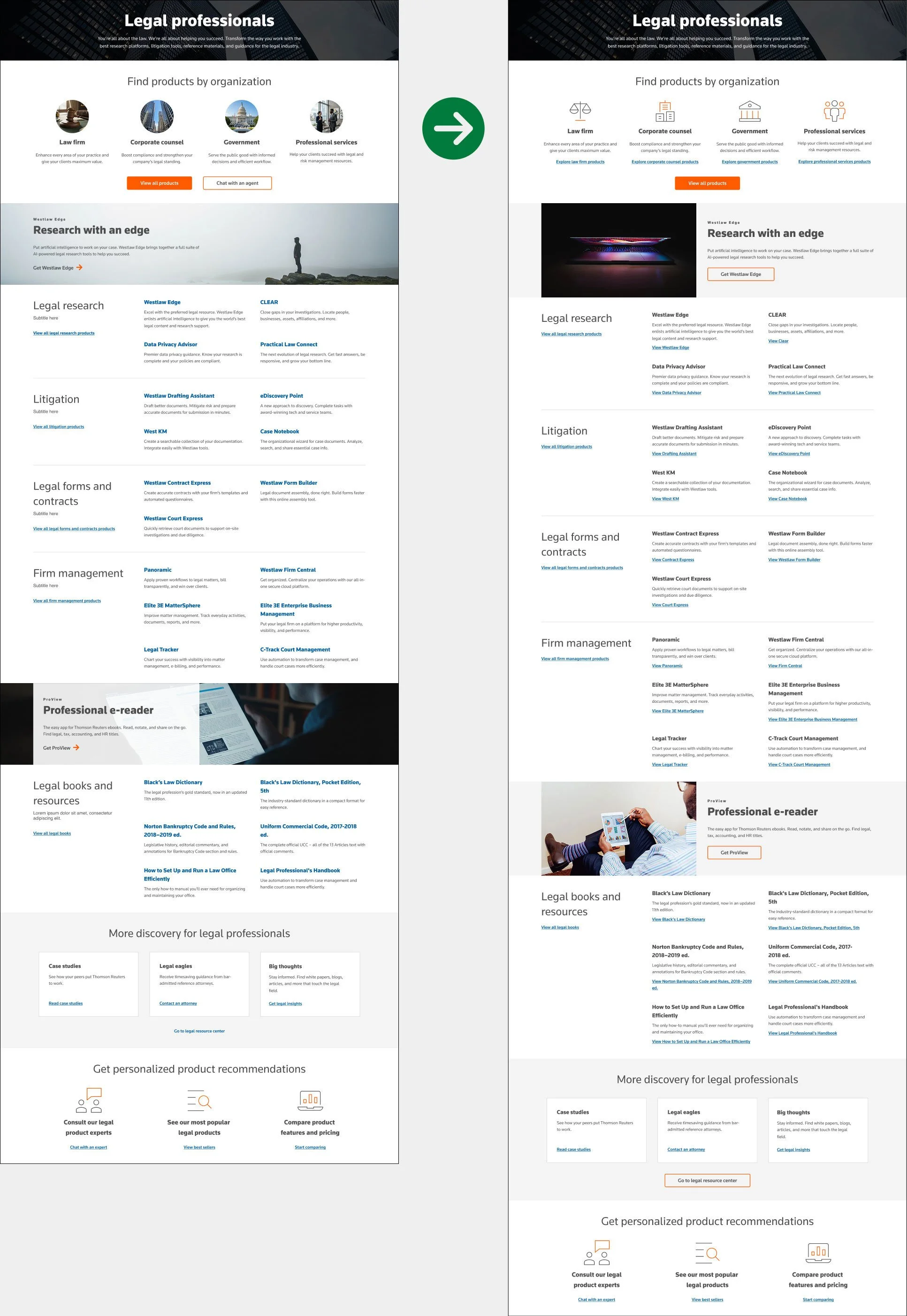
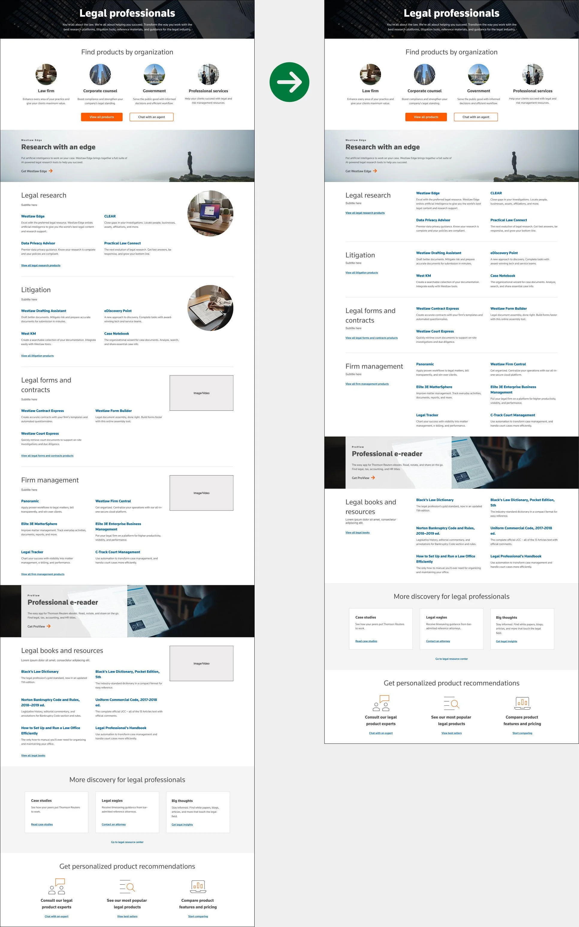
Products by organization
Used circular avatar imagery to guide users into specific product flows, continuing the style set earlier in the page. This pattern didn't survive. I'll explain why in Round 2.
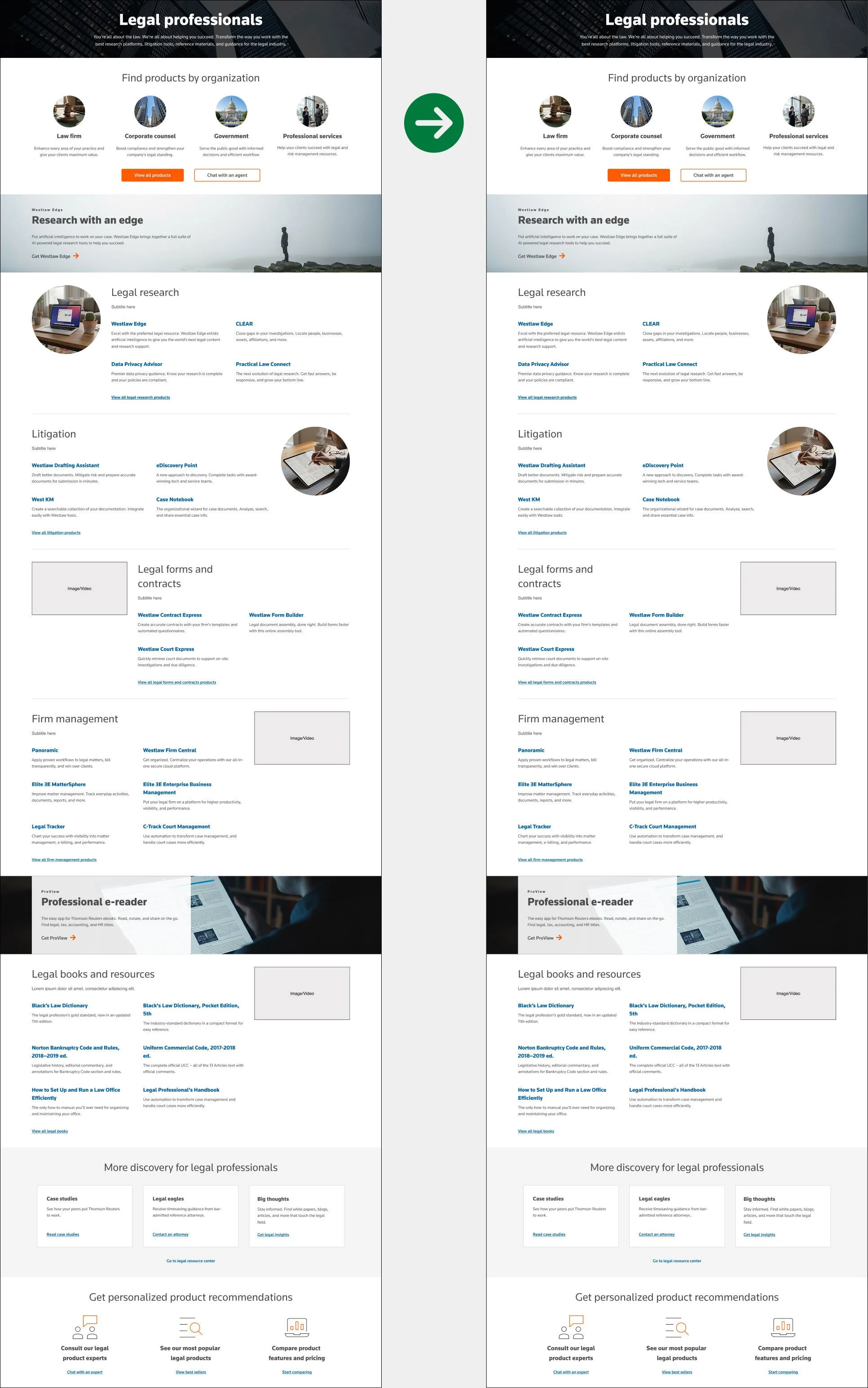
More products
Used an established card pattern with one change. I recommended blue, underlined hyperlinks instead of the system's default gray text with orange arrows, since blue links read as more obviously clickable while gray text blends too closely with body copy. I flagged this for testing rather than assuming it was the right call.
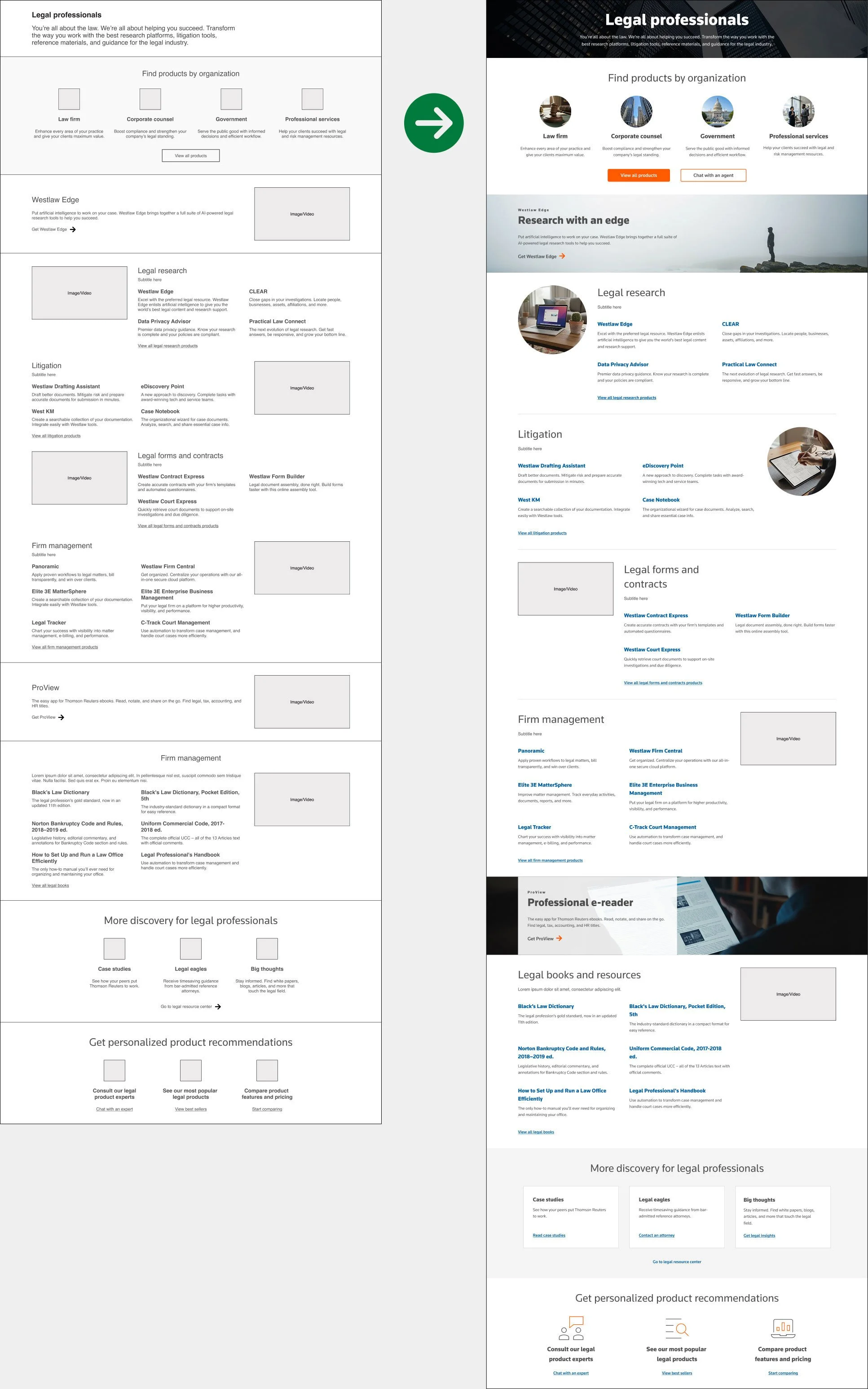
Promo banners
Two full-width image banners sit at the top and bottom of the page. These raised early accessibility concerns, and image governance will need close attention going forward with this format.
Help links
A user reaching this point likely hasn't found what they need yet. As with the product cards above, I recommended blue hyperlinks here too, replacing the system's gray text.
Round 2
This round focused on the product listings and removing the zigzag pattern.
Product listings by section update
I removed the zigzag pattern and aligned all imagery to the right instead. This fixed the eye strain concerns from Round 1 and made the section much easier to scan.
The removal of imagery
We knew this page was the first of several discipline landing pages, including legal and tax. That made me question whether stock imagery was actually adding value, or just adding visual noise.
Moving forward with these changes
I raised these concerns with the UX Designer, and together we agreed to explore removing stock photography altogether.
Round 3
This round continued to focus on the product listings, image treatment, and content alignment.
Listings re-structured
With the imagery gone, I moved the product listings to the right and shifted the section tiles, descriptions, and view all links to the left. Each section now reads left to right, making it much easier to scan the tiles from top to bottom.
Less scrolling
Scannability had another benefit too. The page became noticeably shorter, cutting over 500 pixels of height without losing any content.
Calls-to-action and accessibility
With the core page design settled, I shifted focus to the finer details, circulating the work internally for feedback and review.
Round 4
Usability concerns about the lack of calls to action drove this final round of revisions, the last before calling this exercise complete.
Above the fold cleanup
We replaced the circular imagery with icons for a cleaner, more unified look at the top of the page. We also added hyperlinked CTA text and removed the "Chat with an expert" CTA, since that need was already addressed elsewhere.
Promo banners
Copy placed over imagery raised accessibility concerns, so we moved to a simpler, more accessible banner design. We also removed the all caps styling from small eyebrow headers like Westlaw Edge and ProView, again for accessibility reasons.
Links and buttons
We added labeled text links below the products and removed the section descriptions, which were starting to feel text heavy and harder to scan. We also converted the text link under the bottom cards into a secondary button.